EMILY WACHOWIAK
  • Home
  • My Work
  • Resume
  • Speaking
  • Mentorship
Back to My Work

Site navigation label test

Navigation Option 1
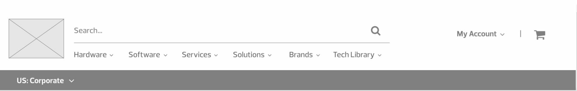
Option 1 (Click to Zoom)
Navigation Option 2 Picture
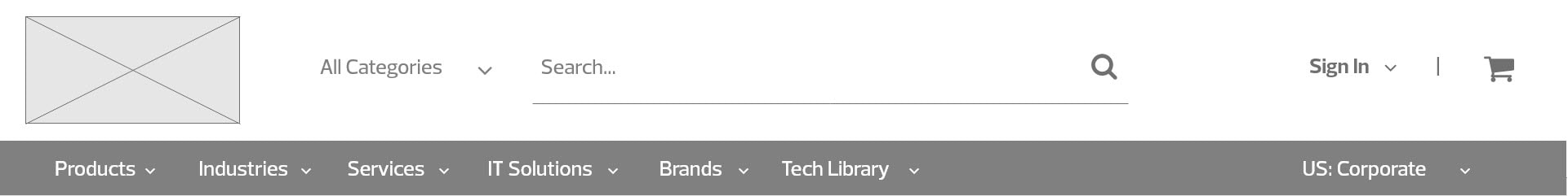
Option 2 (Click to Zoom)
Navigation Option 3
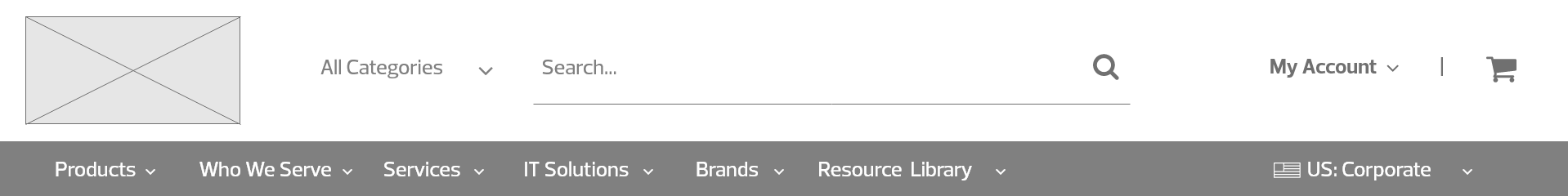
Option 3 (Click to Zoom)

​Challenge: CDW wants to be seen as an international solutions provider, not just a box pusher. How can our navigation shape the perception of our brand without sacrificing e-commerce usability?

​Solution: Use UserTesting.com to test usability and user's overall brand perception of three site navigation L1 label proposals

How I helped:
  • Collaborated with UX teams on three different label options using previous taxonomy research and usability studies
  • Designed, ran, and analyzed three user tests (5 users per test)
  • Shared summary with UX team for further consideration

Results

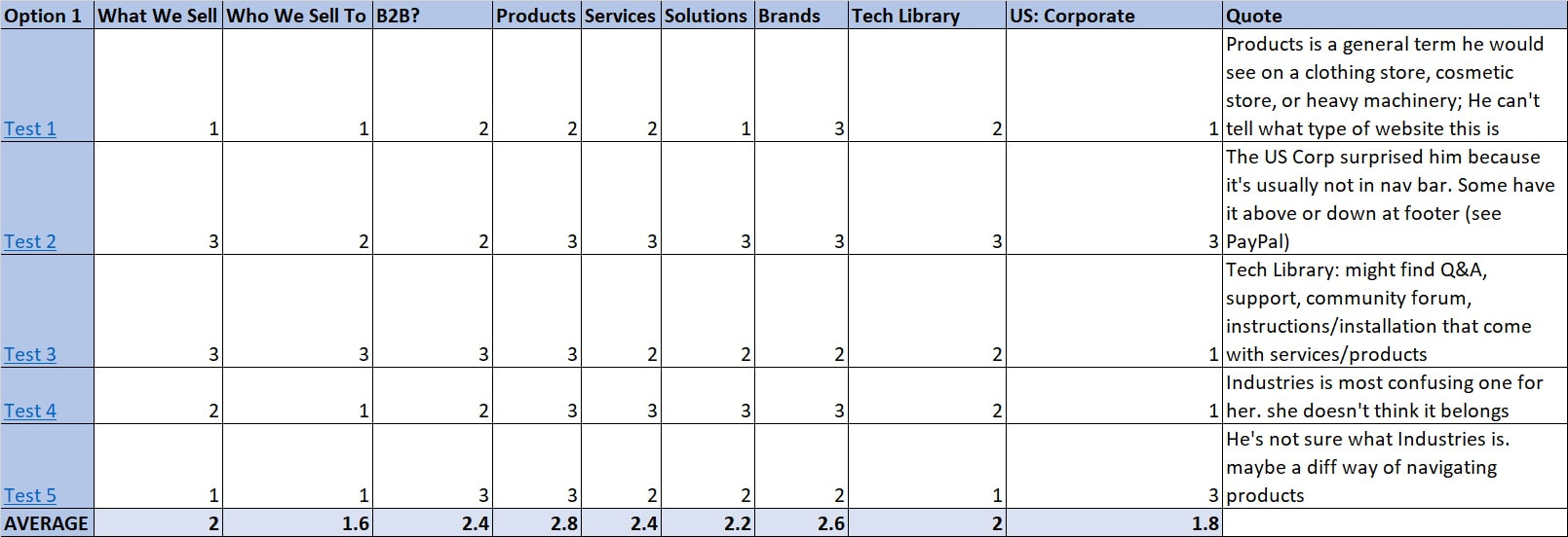
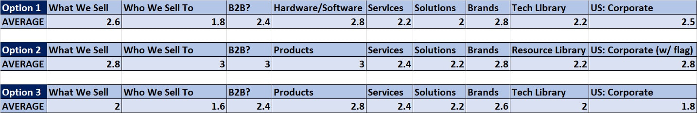
I synthesized the user tests into a spreadsheet by characterizing their reactions to each label on a scale of 1 to 3. A "1" means they user did not understand the concept at all, "2" means they got the gist of it, and "3" means they understood it quite well. Although this isn’t a scientific, I found it was a good gut check for comparing similar options.

Key takeaways:
  • Without context words like Hardware/Software (Option 1) and IT Solutions (Option 2) , users were pretty lost about what we sold.
    • Recommendation: Keep IT Solutions label
      ​
  • ​Our B2B, industry-specific offerings are a key part of our brand. Option 3, which used the Who We Serve Label, universally got the point across that we are a B2B company that serves multiple industries.​​
    • Recommendation: Keep Who We Serve in navigation for industry-specific content and product offerings; consider including case studies as available.
  • Tech Library vs. Resource library: not a big difference in perception here, so current label (Tech Library) is fine to keep.

  • Note: In the absence if “IT Solutions,” and “hardware/software” labels, the word “Tech” was the only indicator of the types of products we sell.​
    • Recommendation: Continue to test this label as we expand into the open menus to gauge expectations vs. reality.

  • Country/corp-gov nav: The flag helped people understand this menu better. Without it, they were more likely to think it was About Us content. The inclusion of this navigation in a prominent spot helped users surmise that we were a company with international reach.​
    • Recommendation: Our international presence will be an important part of our brand moving forward. I’d advise including this nav in the header.
      ​
  • I suggest we keep testing some of these labels moving forward as we build the inner menus out and keep refining
Option 3 Summary
Option 3 Summary (Click to Zoom)
User Testing Summary
Summary Tab (Click to Zoom)

Back to my work
Previous / Next
Proudly powered by Weebly
  • Home
  • My Work
  • Resume
  • Speaking
  • Mentorship